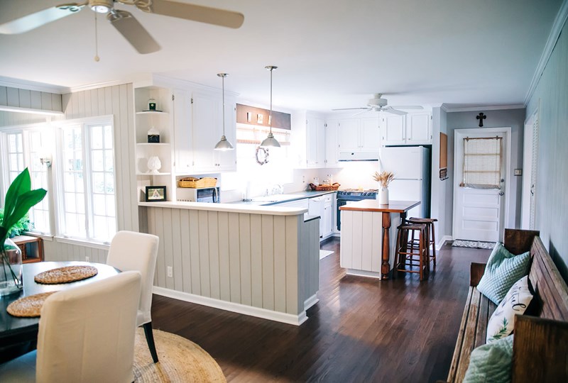
Key Insights
- Use a monochromatic color scheme for continuity between room boundaries.
- Play with scale when furnishing your home.
- Incorporate light–both natural and artificial–to highlight the space you have.
- Rely on decorating best practices that draw the eye to any additional room you have.
- Declutter and optimize blank space to make the most of your square footage.
Big, open spaces are appealing when it comes to homes. But even if you’re short on space, you can still make your home feel open and roomy. Whether you’re trying to make the most of the room you have or looking to appeal to buyers, there are a variety of ways to create the feeling of a spacious home, even if you’re working with a closed floor plan. Try incorporating these ideas to maximize your square footage.
Go for a monochromatic color scheme
White is especially good for brightening up a room and making it appear larger by reflecting light better for a more open, spacious feel, but neutrals are also a great choice (especially when staging a home). However, a unified dark space can also work by blurring room boundaries. This is also true when incorporating tile into a space–smaller tiles require more grout that can visually break up a space, while bigger tiles create a more seamless look.
If you have an open-concept home, think about using the same flooring and paint colors throughout to create connection and continuous space instead of visually chopping it up with textiles and colors.
Rethink your furniture and play with scale
Furniture takes up the majority of your space. Instead of fighting it, play with scale when it comes to your furniture, and balance items. For instance, have a king-sized bed, but get rid of a footboard and choose a tall headboard to draw the eye up since there’s less horizontal free space.
Consider moving furniture away from the walls so it doesn’t feel like you’re at a loss for room. Opt for pieces that are transparent or have slim legs and forgo pieces that are clunky or have skirts to keep the eye from going to the ground. The goal is to allow the eye to travel further around the room with limited interruption.
Use light to highlight the space you have
Be sure to remove anything that may be blocking natural light sources (furniture, decor, overgrown trees, etc.) and keep windows clean. Install lower and wider windows to optimize this effect, keeping in mind that “green” home improvements may be eligible for tax deductions.
For spaces without natural light, layer your lighting using multiple sources (overhead, sconces, lamps, under cabinet lighting, spotlights, etc.) to brighten up any dark corners and show every inch of your space. When choosing your light bulbs, look for cool lighting that’s whiter and brighter to better highlight the room. You can also place mirrors or use glossy surfaces opposite to bounce and reflect light around the room.
Rely on decorating best practices
A keen eye for decor can make all the difference! Utilize simple decorating best practices that help guide the eye and give the feeling of a spacious home.
- Hang drapes closer to the ceiling and past the window casing to draw the eyes up and out.
- Paint the ceiling the same as the walls to visually expand the space.
- Use wide planks of flooring or tile to help accentuate the length and width of a room.
- Frame furniture with an appropriately sized rug.
- Point lights up to add vertical height.
- Incorporate glass to break down visual barriers while also letting in extra light.
Declutter and create blank space
Get rid of any clutter and add more real estate to your home. Remove anything that blocks a visual or physical pathway and go for one or two pieces of larger art to make the walls feel larger and play with scale. Having too much on the walls can make your home look smaller than it actually is. Instead, create a focal point and allow that to shine.
If you are dealing with clutter you can’t get rid of, consider hidden storage options like an ottoman that doubles as a blanket box, or eliminate the need for bookshelves and other bulky furniture with wall shelves that draw the eye up and toward non-cluttered areas. If you do opt for shelving, streamline your items and allow for blank space to highlight key decor. When storage spaces are packed, it gives the sense of not having enough room and makes your home look smaller.
Make the most of what you have
Making some small changes can have a huge impact on how big your home feels. By incorporating these tips and ideas, you’ll be able to increase the feeling of square footage without adding an inch of space.
For more ideas on how to best stage your home for showings and make the most of the home you have, reach out to Edina Realty or one of our agents today.


 ©2025 Prosperity Home Mortgage LLC®. (877) 275-1762. 3060 Williams Drive, Suite 600, Fairfax, VA 22031. All first mortgage products are provided by Prosperity Home Mortgage, LLC®. Not all mortgage products may be available in all areas. Not all borrowers will qualify. NMLS ID #75164 (For licensing information go to: NMLS Consumer Access at